The Future of Translation Is Intelligent Orchestration


Articles & Think Pieces

Are you reinventing the wheel for market research translations?
The Future of Translation Is Intelligent Orchestration

A Practical Approach to Medical Device Global Readiness
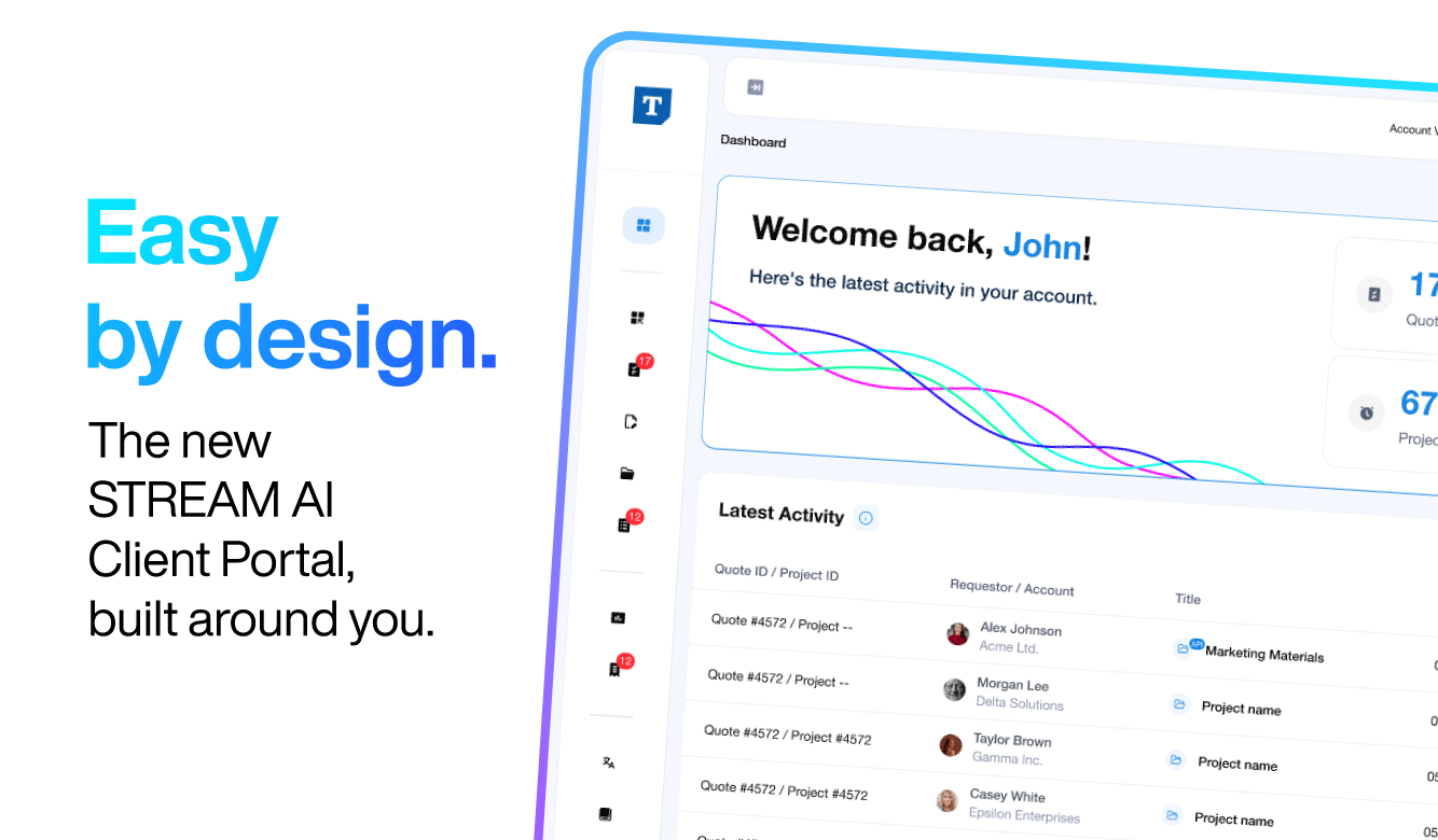
Introducing the STREAM AI Client Portal
A Pragmatic Guide to Onshoring for Managed Care Organizations
Why Managed AI is Critical to Managing Risk in AI Translations

6 Steps to Successfully Implement AI Translation Using Managed AI
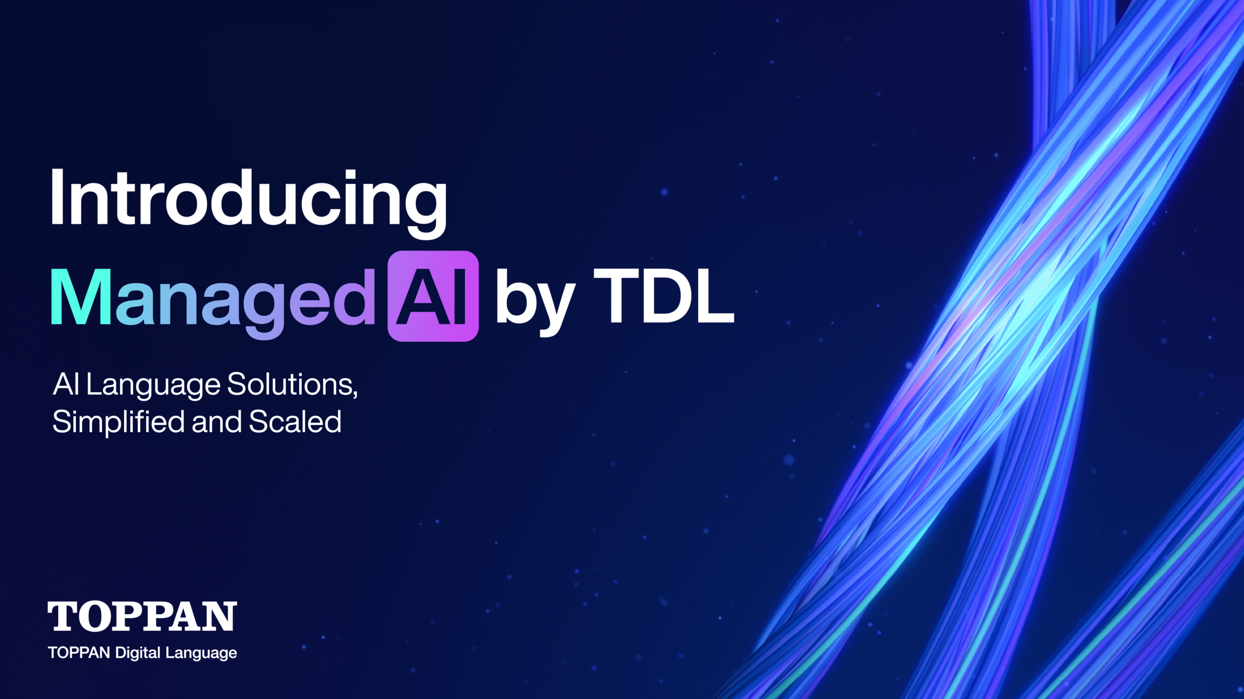
Introducing Managed AI: AI Language Solutions, Simplified and Scaled
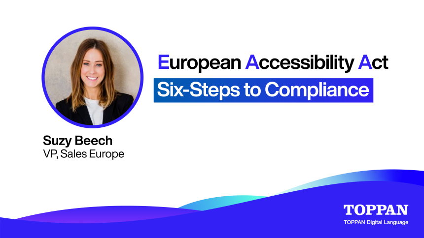
European Accessibility Act: A Six-Step Roadmap to Accessibility Compliance
Web accessibility compliance requires more than a quick scan of your homepage. Below is a six‑step process that turns compliance into an organization‑wide habit.
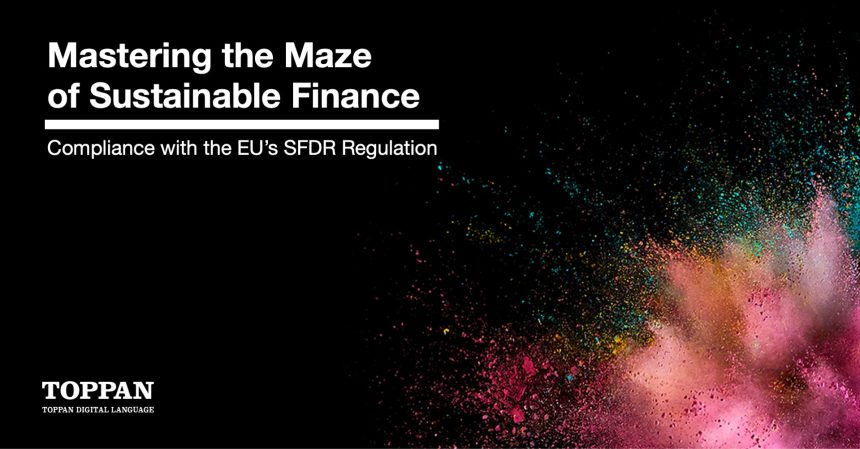
Mastering the Maze of Sustainable Finance: Compliance with the EU's SFDR Regulation
See More!
Case Studies

Translation of eLearning courses for multiple countries.

Translation and localisation of online marketing tool under intense time pressure.

Can you keep up with a titan CRO and reduce translation costs by 20%?

Translation and typesetting of multiple complex files.

Multilingual Community Panel Moderation in Multiple Markets

Translation and link-check of fashion retail questionnaire for 36 markets.

Can You Increase Global Visibility, Revenue, and ROI with Transcreation?

Creative medical translation for disease awareness campaign.

Translation of complex market research consumer questionnaires.

Two simultaneous multi-country questionnaires in Excel with HTML tags and a complex language mix.
See More!
Press Release
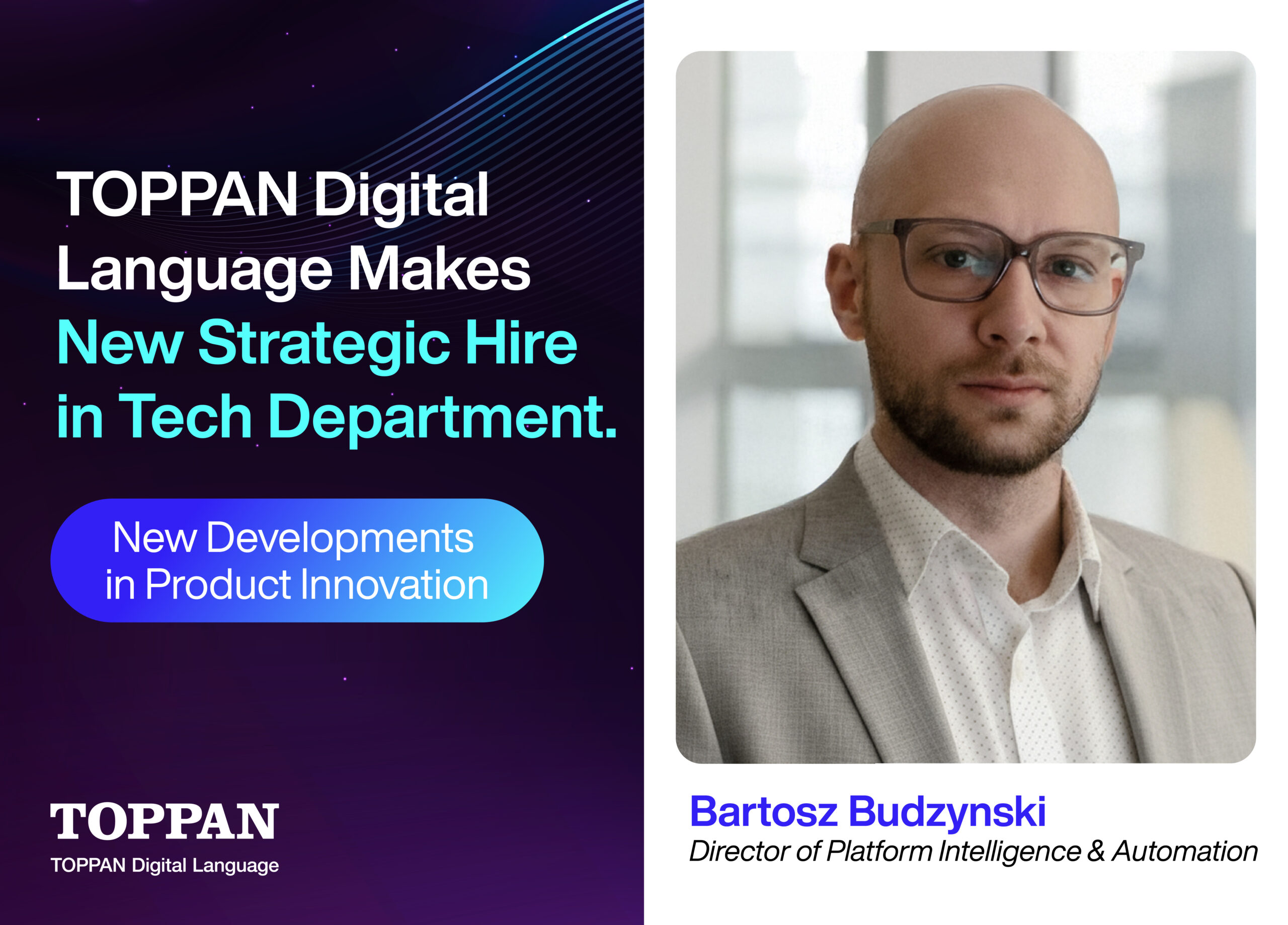
TOPPAN Digital Language Announces Bartosz Budzynski as Director of Platform Intelligence & Automation
TOPPAN Digital IP Announces the Launch of STREAM IP
TOPPAN Digital Language Attains HITRUST r2 Certification for STREAM AI
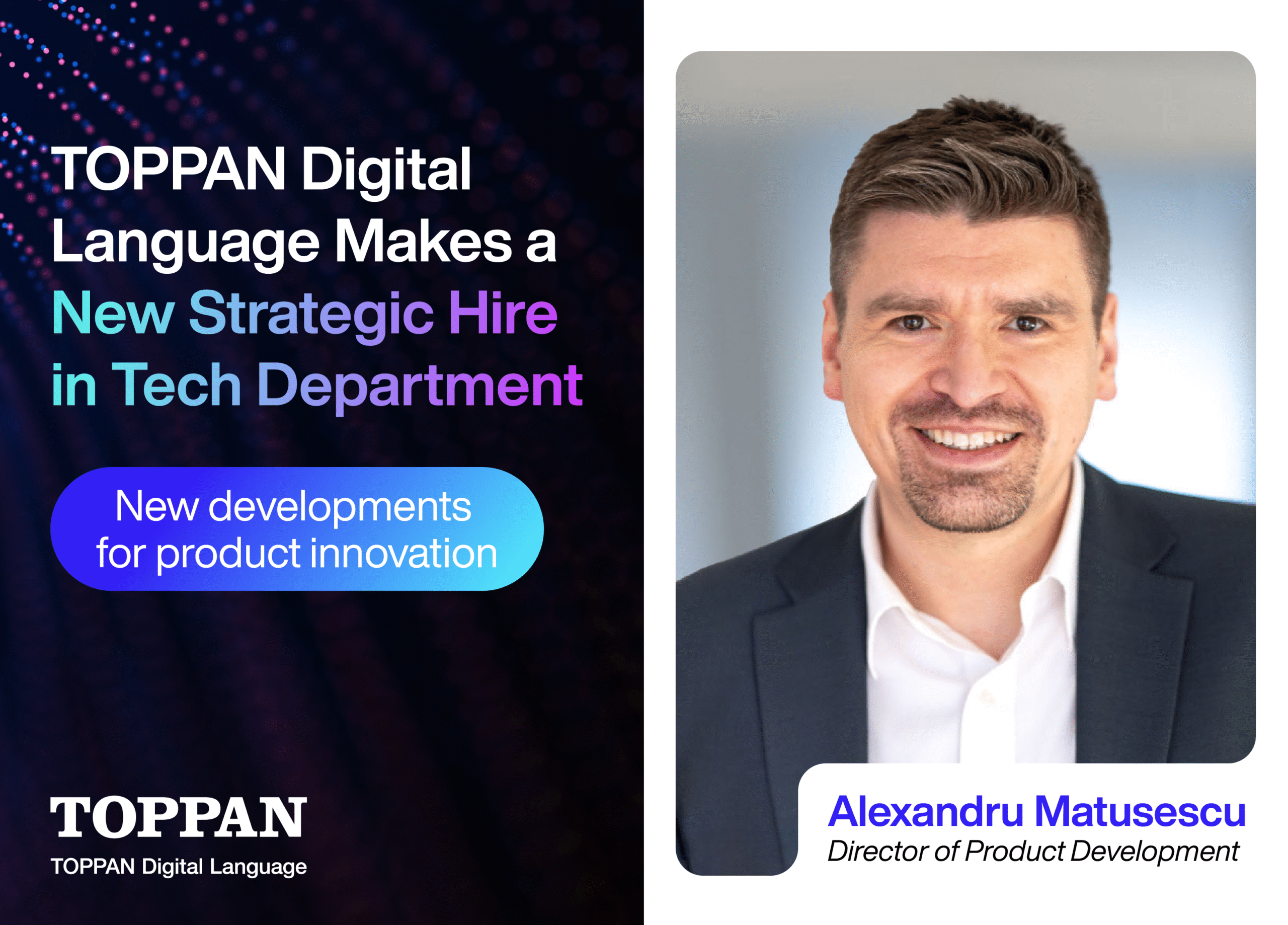
TOPPAN Digital Language Announces Alexandru Matusescu as Director of Product
TOPPAN Digital Language Launches New IP Filing and Translation Business
TOPPAN Digital Language Announces the Launch of STREAM AI and Managed AI

TOPPAN Digital Language Announce New Office in Beijing
TOPPAN Digital Language acquires Austrian LSP MEINRAD

TOPPAN Digital Language Announce New Office in Korea
TOPPAN Digital Language Boosts Technical Prowess with Strategic New Hires in Tech Department
See More!