The Future of Translation Is Intelligent Orchestration


Articles & Think Pieces
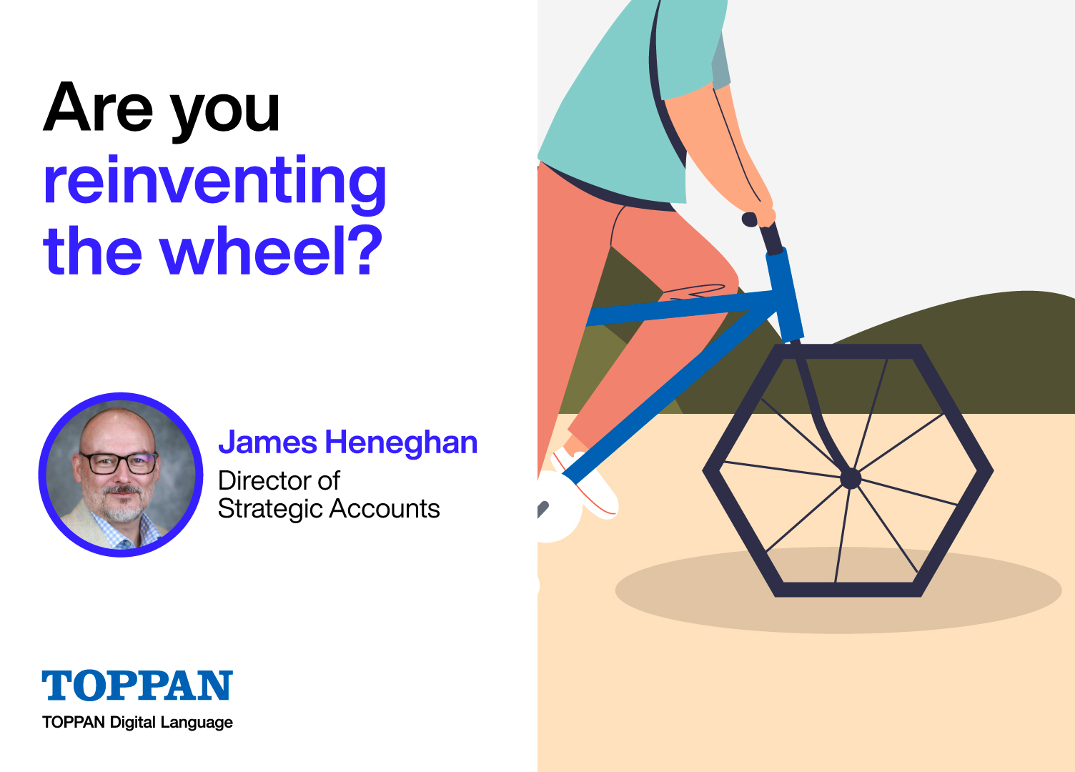
Are you reinventing the wheel for market research translations?
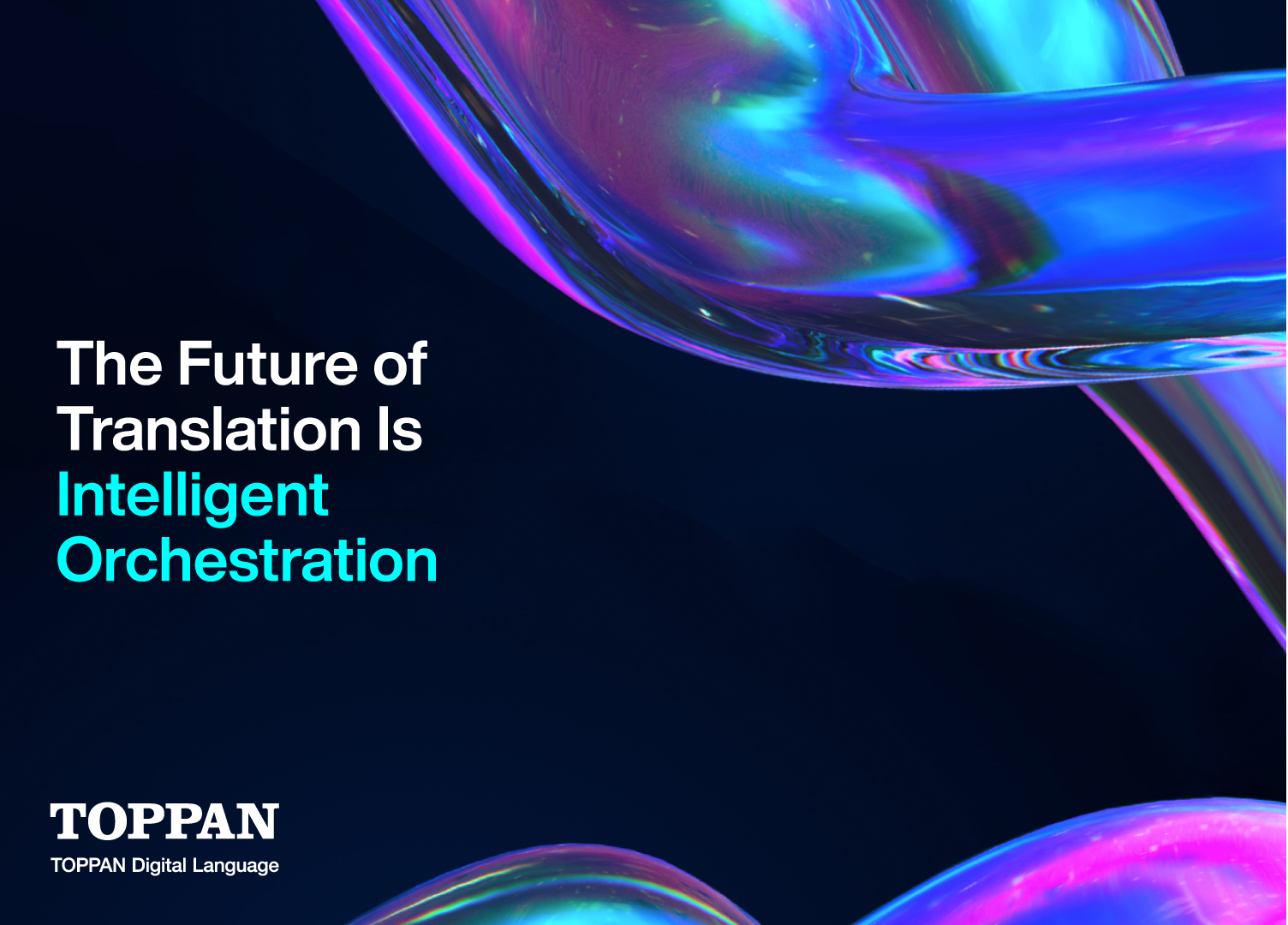
The Future of Translation Is Intelligent Orchestration
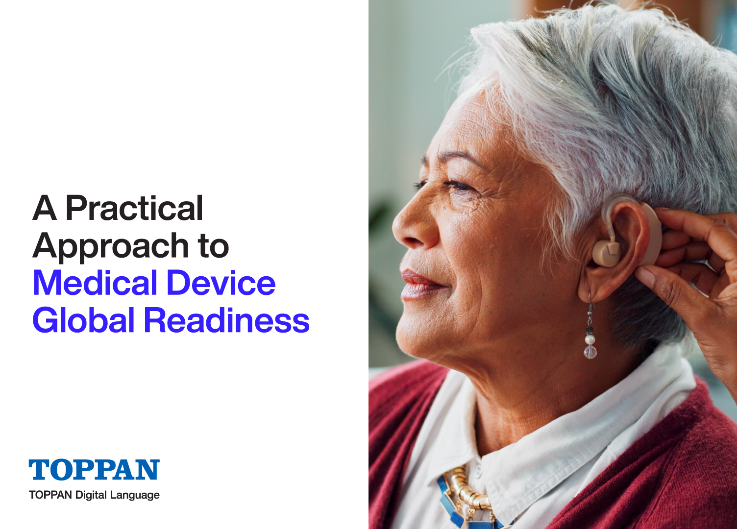
A Practical Approach to Medical Device Global Readiness
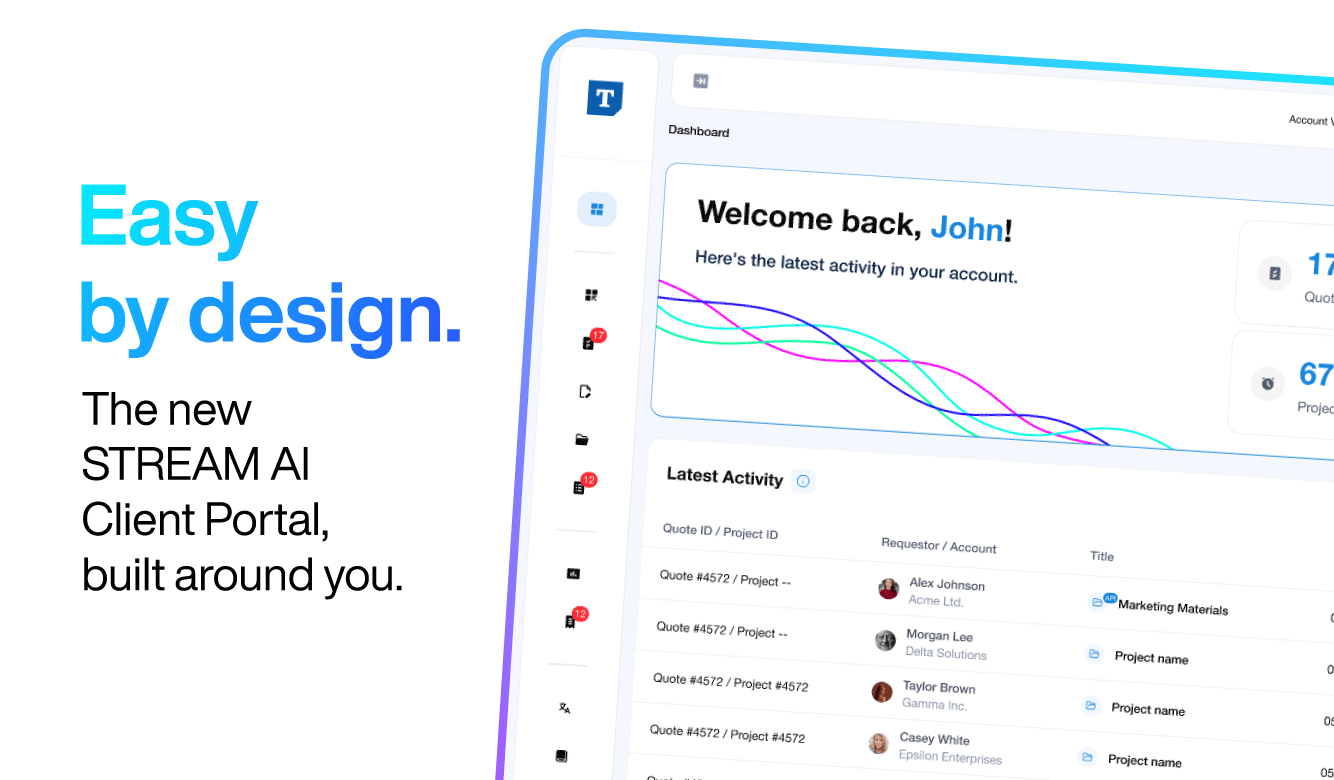
Introducing the STREAM AI Client Portal
A Pragmatic Guide to Onshoring for Managed Care Organizations
Why Managed AI is Critical to Managing Risk in AI Translations
6 Steps to Successfully Implement AI Translation Using Managed AI
Introducing Managed AI: AI Language Solutions, Simplified and Scaled
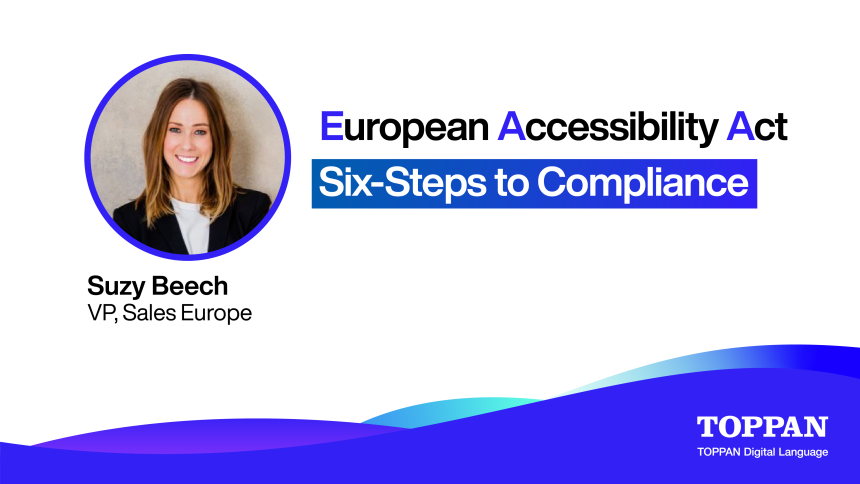
European Accessibility Act: A Six-Step Roadmap to Accessibility Compliance
Web accessibility compliance requires more than a quick scan of your homepage. Below is a six‑step process that turns compliance into an organization‑wide habit.
Mastering the Maze of Sustainable Finance: Compliance with the EU's SFDR Regulation
See More!
Case Studies

150,000 Words, Three Languages, One Ready-to-Publish Training Programme for Imparta
Imparta needed more than a translator. They needed a partner capable of handling complex, multimedia training content across three languages, without compromising quality or format. Here's how TOPPAN Digital Language delivered a complete, ready-to-publish solution at scale.

Technical Marketing Content, 9 Languages, Zero Glossary Drift: How We Kept a Global Marketing Agency on Schedule
Nine languages. A technical subject. Multiple formats. And a deadline set by one of the world's largest marketing networks. When consistency across every language version is non-negotiable, the project structure has to be right from day one.

Cutting Costs by 20% While Scaling to 5,500 Projects a Year : How We Kept Pace with a Titan CRO
When one of the world's largest clinical research organizations needed a translation partner that could match their scale, speed and precision, they needed an extension of their team. Here's how we became exactly that and transformed their multilingual content operations in the process.

When a German Facility Must Match Its UK Twin: Delivering Consistent Technical DTP Across Europe
When a German Retail Facility in the UK should look exactly like its twin in Germany. For a fast-expanding European retailer, that means every AutoCAD drawing, every translated document, every updated version must be pixel-perfect, across languages, markets and construction phases. Here's how we made that possible.

Native Voices, One Brief: Delivering Consistent Panel Moderation for a Global Research Agency
Moderating online research panels across multiple languages is a holistically human process. Replies need to feel native, probing needs to feel natural and consistency across markets can't be an afterthought. Here's how we became Verve's trusted moderation team across five markets.

Fashion Retail Goes Global: A Questionnaire Built to Work Across 36 markets
Thirty-six markets. Multiple waves. Rare languages. And a timeline that left no room for error. When a global fashion retailer needed consumer insights at this scale, Firefish needed a language partner that could keep pace and advise along the way.

Beyond Keywords: How a Global Sportswear Retailer Captured European Search and Sales
Translating product pages is easy. Making them rank, resonate and convert across five European markets is something else entirely. For one iconic sportswear retailer, the answer wasn't localization, it was transcreation - backed by multilingual SEO strategy from day one.

Science and Emotion, Translated: How We Localised a Global Healthcare Campaign for Specialist Audiences
A disease awareness campaign lives or dies by the precision of its language: both scientific and emotional. When Cello Health Insight needed their healthcare campaign localized for medical professionals across the US, Japan and four European markets, accuracy alone wasn't enough.

Culturally Adapted, Terminologically Consistent: Supporting Mintel's Global Consumer Surveys Across 5 Markets
For global market intelligence, consistency is the foundation of reliable data. Mintel needed every survey wave to align perfectly across five European markets, with cultural nuance baked in. Here's how we made that continuity seamless.

Double the Complexity, Half the Time: 18 Markets, Two Surveys, One Team
Two studies. Eighteen markets. Ninety-six hours. What would normally take five days per study had to be done simultaneously, without sacrificing the quality that clean consumer data demands. Here's how we made it happen over a weekend.
See More!
Press Release
TOPPAN Digital Language and Hei Announce New Partnership
TOPPAN Digital Language and Hei Announce New Partnership
TOPPAN Digital IP Announces the Launch of STREAM IP
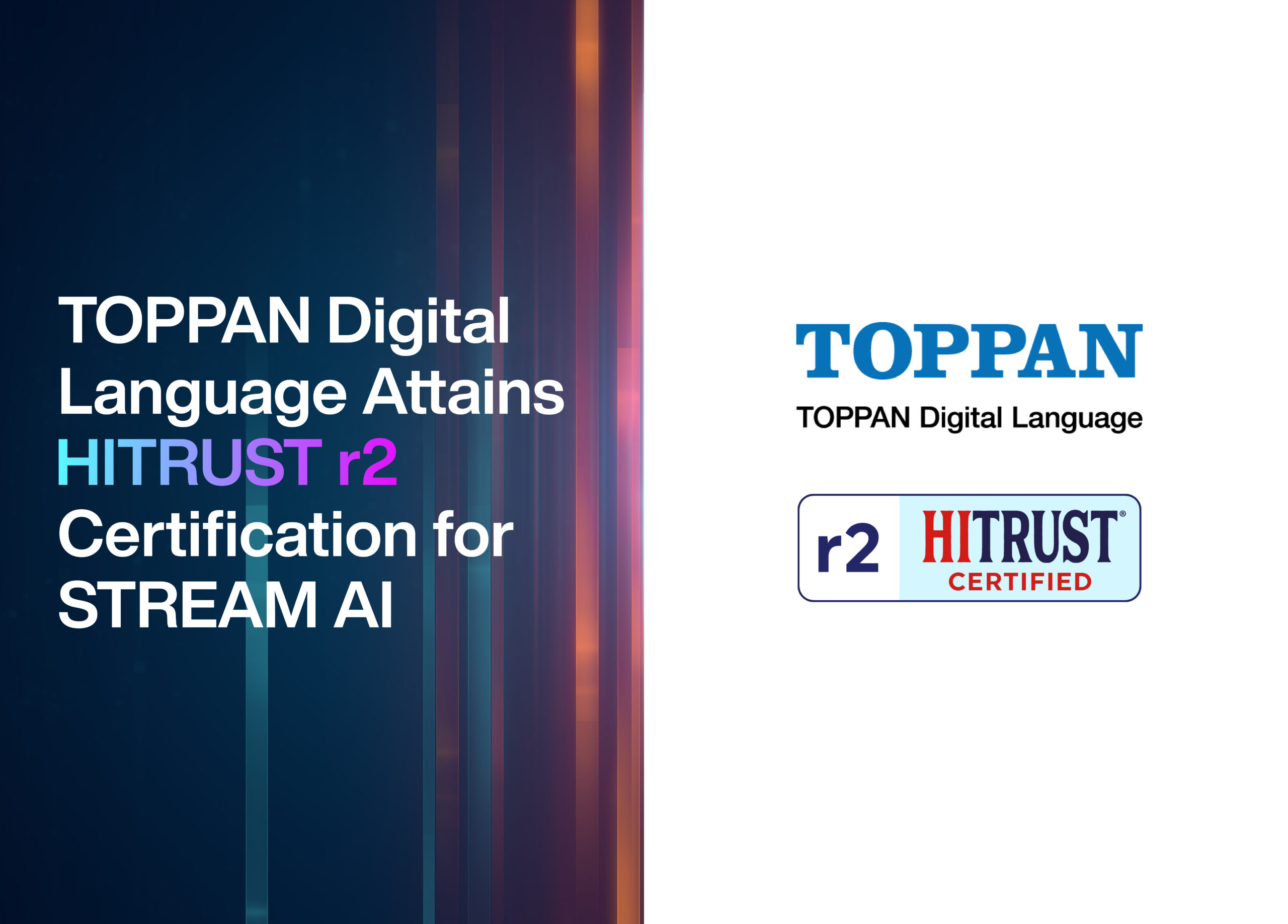
TOPPAN Digital Language Attains HITRUST r2 Certification for STREAM AI
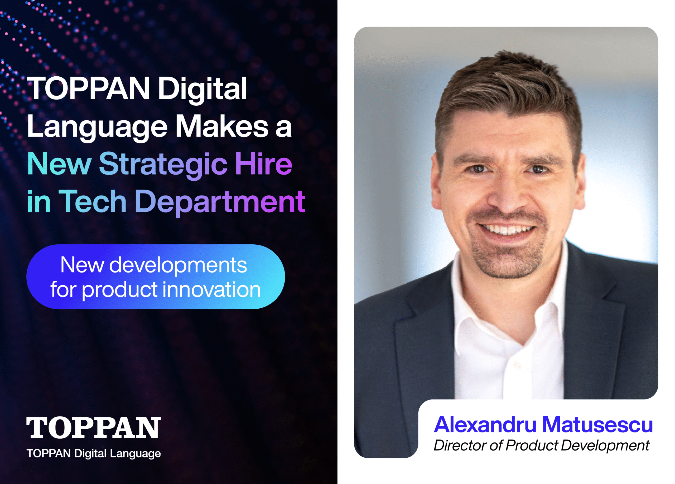
TOPPAN Digital Language Announces Alexandru Matusescu as Director of Product
TOPPAN Digital Language Launches New IP Filing and Translation Business
TOPPAN Digital Language Announces the Launch of STREAM AI and Managed AI
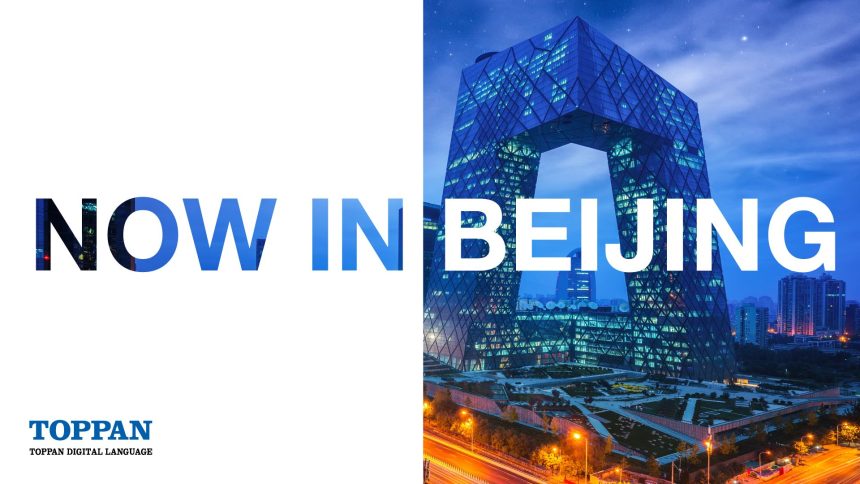
TOPPAN Digital Language Announce New Office in Beijing
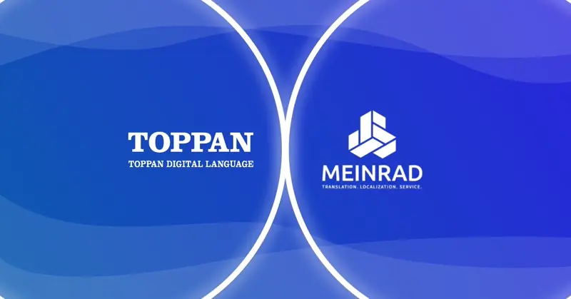
TOPPAN Digital Language acquires Austrian LSP MEINRAD

TOPPAN Digital Language Announce New Office in Korea
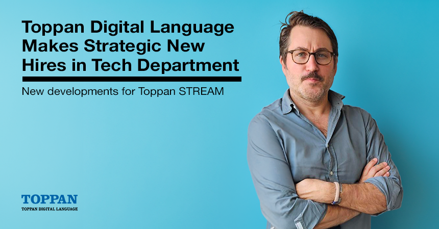
TOPPAN Digital Language Boosts Technical Prowess with Strategic New Hires in Tech Department
See More!